Key takeaways
- First you choose how real your child looks: illustrated, a real-looking child in a drawn world, or photo-real.
- Then a look: classic storybook, watercolour, pencil, gouache, painter's touch or cartoon.
- Strength controls how stylised it gets. Low keeps more of the photo; high looks more like a drawing.
- Soft looks suit toddlers and bedtime; cartoon suits five-to-eight-year-olds who like adventure.
The same tale can feel completely different in two styles. A watercolour Goldilocks is soft and quiet. A cartoon Goldilocks is louder and funnier. Neither is better; they suit different children, and some children have very firm opinions.
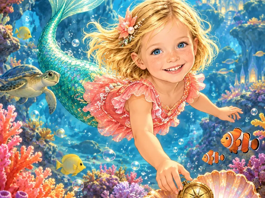
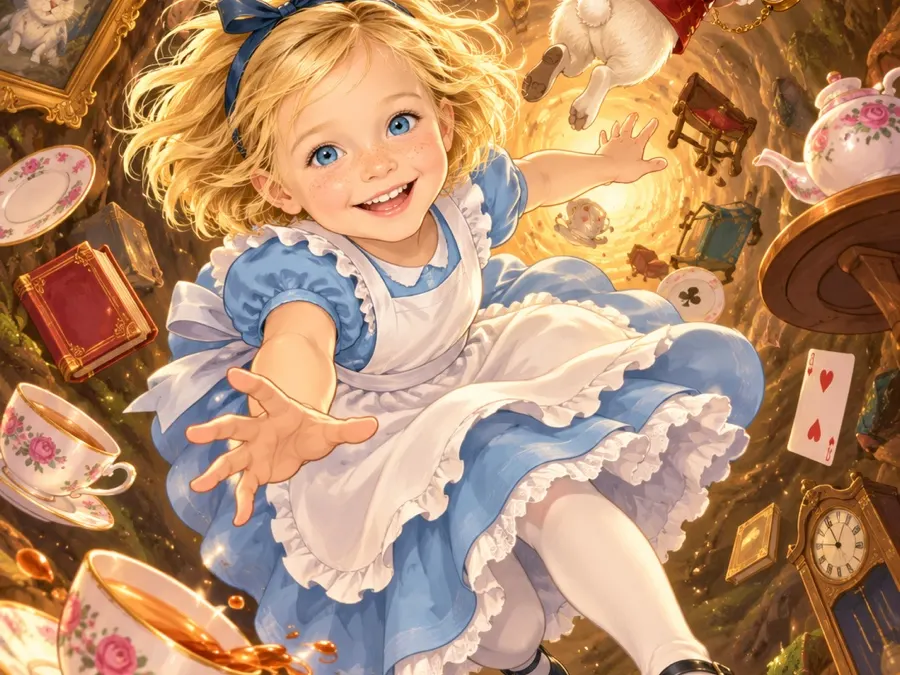
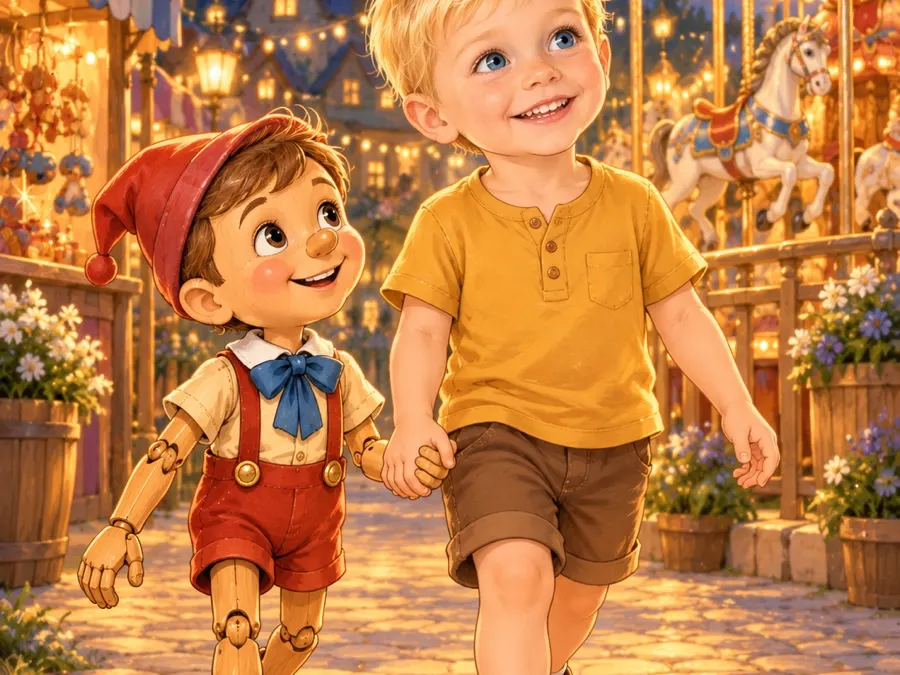
These are the options on I Am In The Story, with the preview images the site uses.
How real should they look?
The first choice is the picture style:
- Illustrated. Your child painted into the story with their own face. This is what every example book on the site uses.
- Photo child, drawn world. Your child looks like a photograph; everything around them is illustrated.
- Photo-real. Child and world both look photographic.
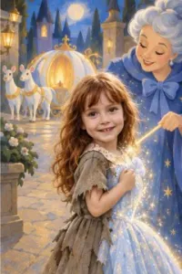
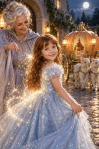
A personal view: the illustrated style is the one that feels most like a picture book, and it’s what we’d choose for under-sevens. Older children, especially those who find “babyish” pictures embarrassing, often prefer the photo-child option.
The looks
Classic storybook. Warm colours and soft outlines, like a much-read picture book. The safe choice for almost any tale; the Little Red Riding Hood and Peter Pan samples use it.
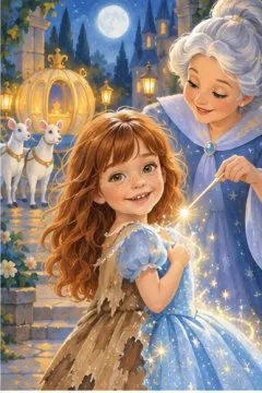
Watercolour. Soft washes and gentle edges. Lovely for babies, toddlers and bedtime books.
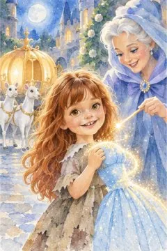
Pencil. Fine hand-drawn lines with light colour. Feels like a sketchbook; nice for a keepsake from grandparents.
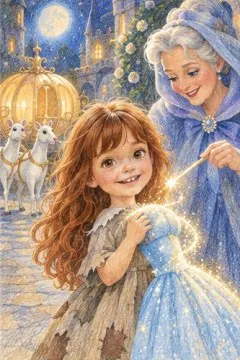
Gouache and painter’s touch. Richer, textured paint, good for dramatic settings like castles, forests and the sea. The Unicorn and the Rainbow sample uses painter’s touch.
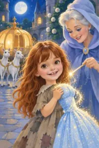
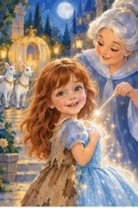
Cartoon. Bold shapes and big expressions. Five-to-eight-year-olds pick this a lot. The Pinocchio sample uses it, and the growing-nose page is funnier for it.
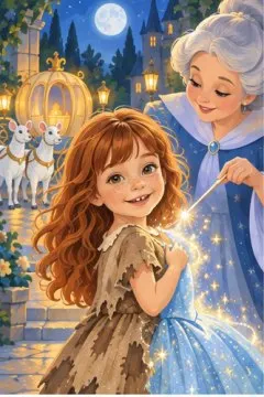
Strength
You also choose how strongly the look is applied. Low keeps more of the photo in the face; high looks more like a drawing. Medium is a sensible default. The unicorn sample is set to low, which is why the painterly style there still looks very much like the photo.
What we’d pick
| Child | Try first |
|---|---|
| Baby or toddler | Watercolour or classic storybook |
| Three to five, loves fairy tales | Classic storybook |
| Five to eight, loves adventure | Cartoon or painter’s touch |
| Wants to look “real” | Photo child in a drawn world |
| Keepsake from grandparents | Pencil or watercolour |
The easiest way to compare is to look at the four sample books, which between them use classic storybook, cartoon and painter’s touch.
Chosen a look? Pick a story, and if you haven’t got a photo yet, the photo guide will help.
Frequently asked questions
Which style gives the closest likeness?
Photo-real and "photo child, drawn world" keep the most of the photo. In the illustrated looks, a low strength stays closer to it.
Which style is best for toddlers?
Soft, simple looks such as watercolour or classic storybook.
Can I change the style after the book is made?
You'd make a new version in the other style. It's worth looking at the previews first.
Pick a fairy tale, add your child
Classic stories children already know by name — each one retold with your child on every page.
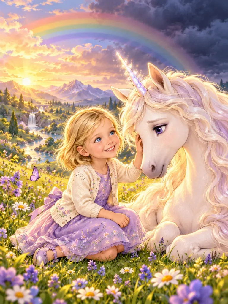
The Unicorn and the Rainbow
Seven colors, one brave little heart
Make this book with your child →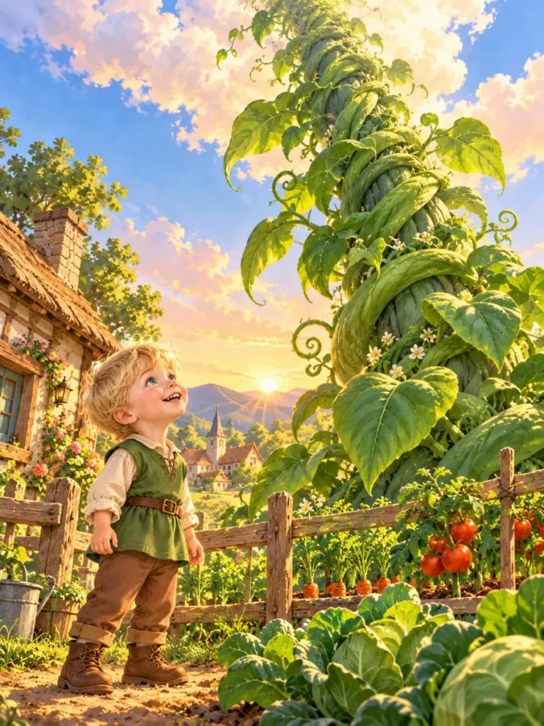
Jack and the Beanstalk
A vine that grows past the clouds
Make this book with your child →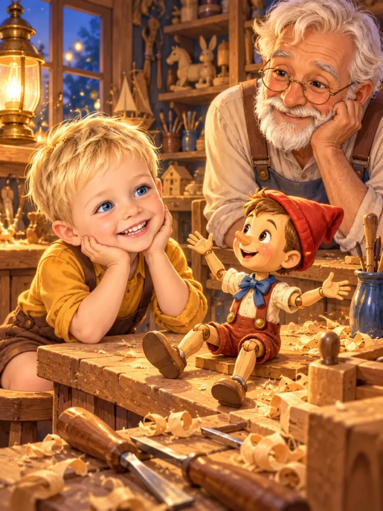
Pinocchio
A wooden friend learning to tell the truth
Make this book with your child →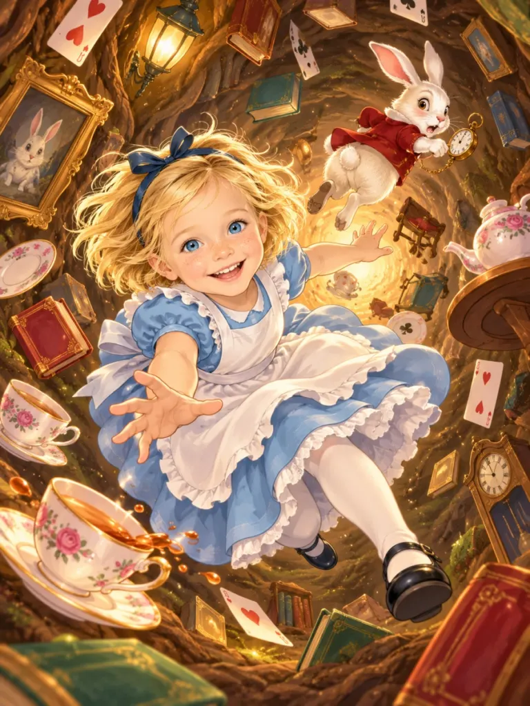
Alice in Wonderland
Down the rabbit hole and curiouser by the page
Make this book with your child →